By: Anna Pinckney, Access/Research Assistant in the Bower Lab
A PIAF (Pictures in a Flash) machine uses heat-sensitive paper to create tactile graphics. This paper is the same size as regular US printer paper, but it feels slightly thicker. To use the PIAF machine, the first step is to put the heat-sensitive paper in a regular printer and print an image like normal. Next, the paper is put through the PIAF machine. As the paper goes through the machine, it heats up, causing the black ink to swell. Then, the blind or low-vision (BLV) user can run their fingers over the paper, and feel the graph! This is also commonly referred to as swell paper.

Fig 1. Pictures in a Flash (PIAF) Tactile Graphics Maker (Photo Credit: https://www.boundlessat.com/Blindness/Braille-Embossers/Piaf-Tactile)
In our day-to-day work in the Bower Lab, PIAFs help us make accessible graphics, relatively quickly. Whether we are trying to access graphics from scientific papers, or create our own maps, graphs, charts, etc., the PIAF machine has proven to be an effective tool in some situations. I’ll provide a few examples from our everyday work below.
One common type of graph we see in oceanography is a time series, a line graph that illustrates how a variable changes with time. Often, a time series is represented as a single line that varies in height as you move from left to right. This is a relatively simple graphic that is compatible with the PIAF machine, however it still requires adjustments before printing. I recommend using Adobe Illustrator to make these adjustments. Adobe Illustrator is a design software that is helpful for creating or editing graphics. I use it to trace figures, add lines, change font colors, increase the size of the graphs, among many other things. Adobe Illustrator can help improve your PIAF graphics especially if you incorporate the following suggestions:
- Use the whole sheet of paper. This may require stretching out the figure, however it makes a big difference for the BLV user to have the whole page to explore tactilely.
- Increase the line thickness. This may take some trial and error, but I found that the PIAF machine doesn’t always pick up on very thin lines. It’s also easier to follow if you use a thicker line.
- Add tick markers. This is necessary for providing some context to the BLV user. To avoid distraction to the data, place the tick markers facing outwards from the axes. Also, make sure they are long and thick enough to easily find.
- Smooth the data, if necessary. Even one line can be too busy if you have a lot of data. Smoothing the data can make it easier to find trends and follow the data on the PIAF. Be sure to be clear about what you did to the data to the person using your PIAF graph if you do end up smoothing it though!
- Add text labels in light gray. Anything printed in light gray (or any color besides black) won’t swell by the PIAF machine. However, these labels can help provide context to the graph that a sighted assistant can use the describe the graph in more detail.

Fig 2. Example of a time series PIAF I made. There’s one black line, large tick marks facing outwards from the axes, light gray labels, and smoothed data making it an easy to read PIAF.
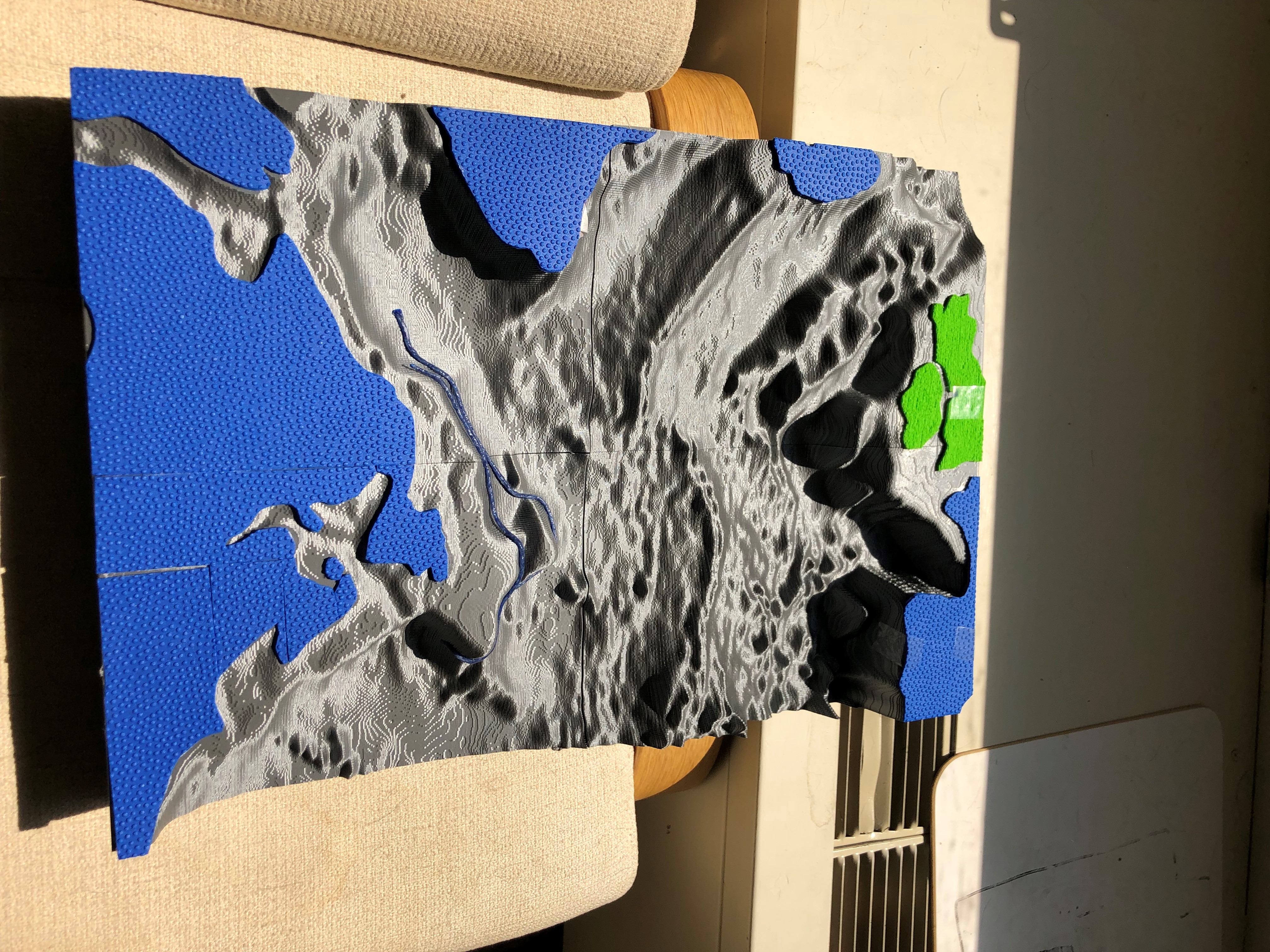
There are other types of graphics that are much harder to show using the PIAF machine, so this is when it’s time to get creative. Recently, I’ve been faced with the challenge of trying to represent probability data. For example, imagine a map of the ocean with a gradient of orange spread throughout it. Dark orange means a lot of particles ended up there, and as the color fades, that means less particles ended up there. As you can imagine, this is much more of a challenge to produce using a PIAF machine than a time series. I started by making a map of the ocean and included bathymetry lines that show the depth of the ocean floor, being sure to follow the suggestions mentioned above. Adding the data that is typically portrayed in color is where it gets tricky! I tried using density of dots instead of color. For example, I used lots of dots closer together when the color is darker, and dots farther apart when the color is lighter. This was not a completely accurate way to represent the data, because I just used my best judgement to place the dots on the paper. While it was not the most successful approach to display this data, it was something new, and fun to try!

Fig 3a (left): An inaccessible map of probability data Fig 3b (right): My attempt at making Fig3a more accessible using the PIAF machine. I zoomed in, smoothed the bathymetry contours, made the lines thicker, and tried to represent the probability data with density of dots.
Overall, the PIAF machine is a fantastic tool for creating some types of tactile graphics. If the figures are simple enough, and you adjust them appropriately, the PIAF machine can be a very useful tool. Let me know if you have any ideas on how to make complex data more accessible using the PIAF machine in the comments below!
Our PIAF is from HumanWare: https://store.humanware.com/hus/piaf-picture-in-a-flash-tactile-graphic-maker.html